Every artist needs a studio.
Studios don’t need to be fancy. They don’t even need to be a dedicated place. Plenty of great art has been made at the dining room table.
No, studios are more space than place. A space to dream. A space to experiment. A space to organize. And a space to work.
Designers are no different. Even though they paint with pixels, every designer still needs a space for their work to live.
And for our Design Team, that space is Basecamp.
We don’t just make Basecamp… we use it, too. For our designers, it becomes a digital studio. A space to collect everything they need to create.
Want to tour one of these studios? Here’s a real design project we brought to life inside Basecamp:
Claiming Your Space
When we commit to making a new feature, function, or product, the first thing we do it give it its own space.
This spring, we decided to build Bubble Up, our take on a snooze function for our email tool HEY. And the very first step was to set up a dedicated project inside our company’s own Basecamp:
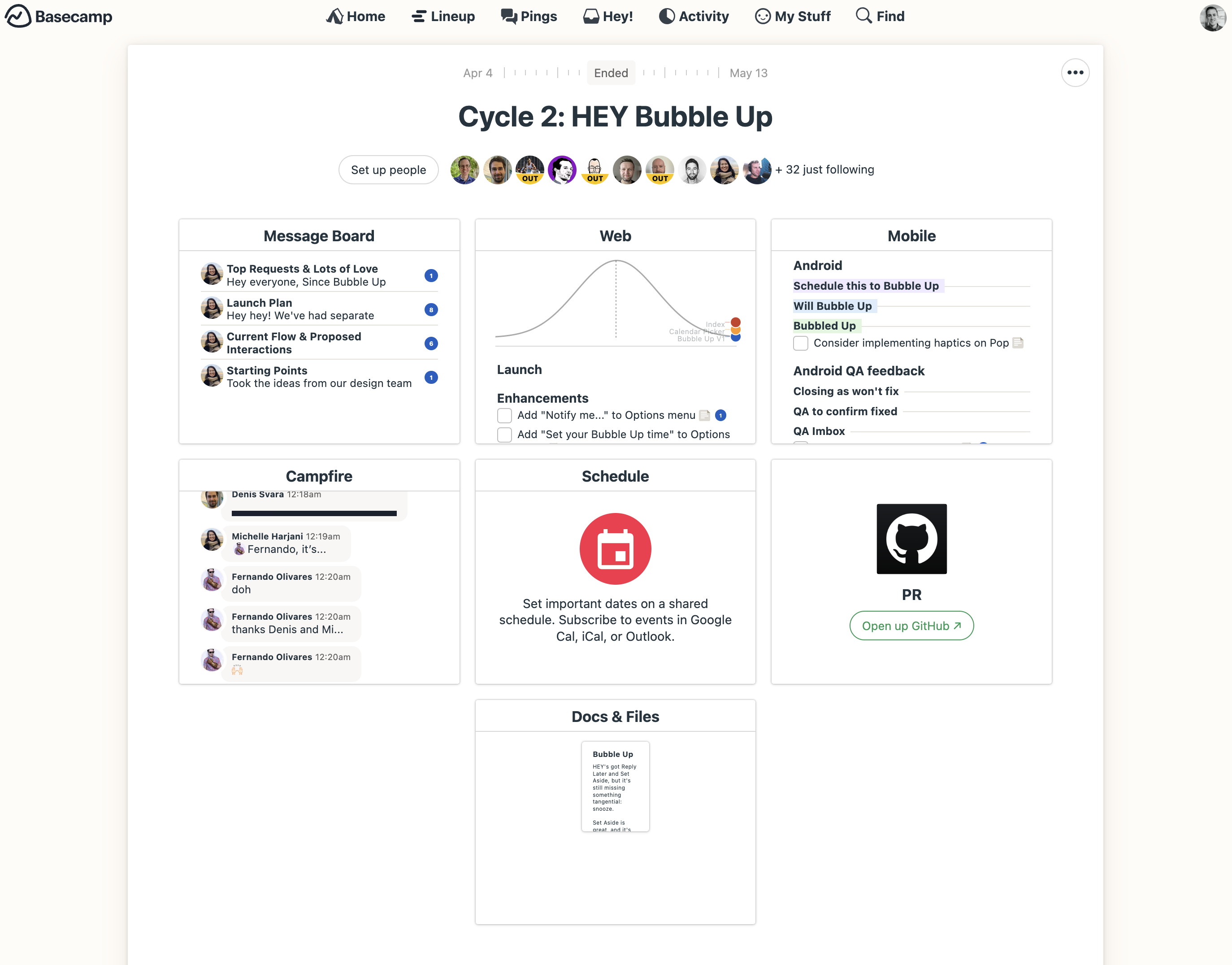
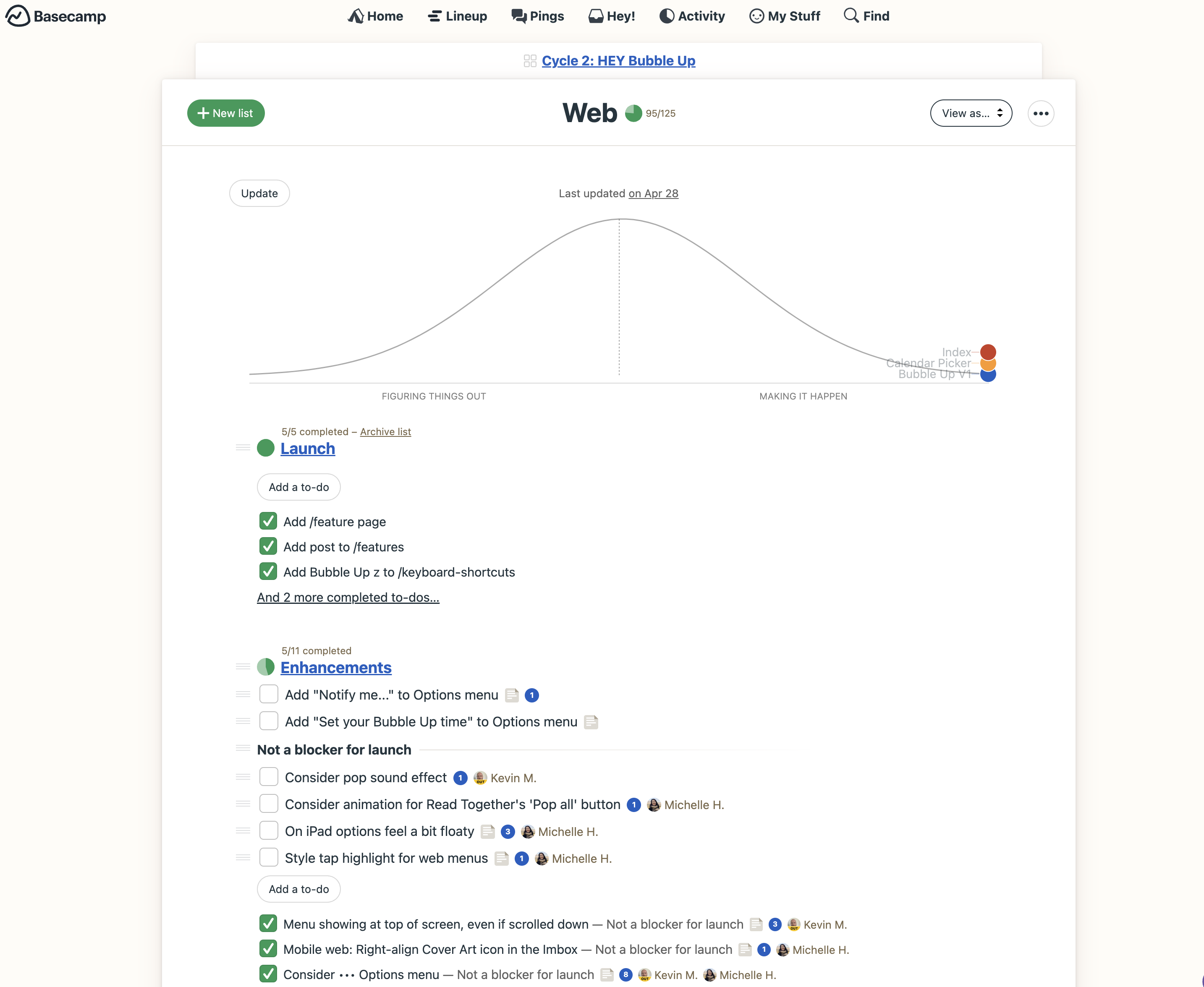
For our talented designer Michelle (who led the design work for Bubble Up), this Basecamp project became her studio for six weeks. Every message, doc, to-do, and timeline now lived in one single space:
From Paper to Pixel
Now that Bubble Up had a space, it was time to bring the idea to life.
We recently shared our thoughts on why wireframes are bad for creativity, and how they do more harm than good for designers. Instead, we rely on fat marker sketches to shape our ideas, as they provide just the right level of resolution.
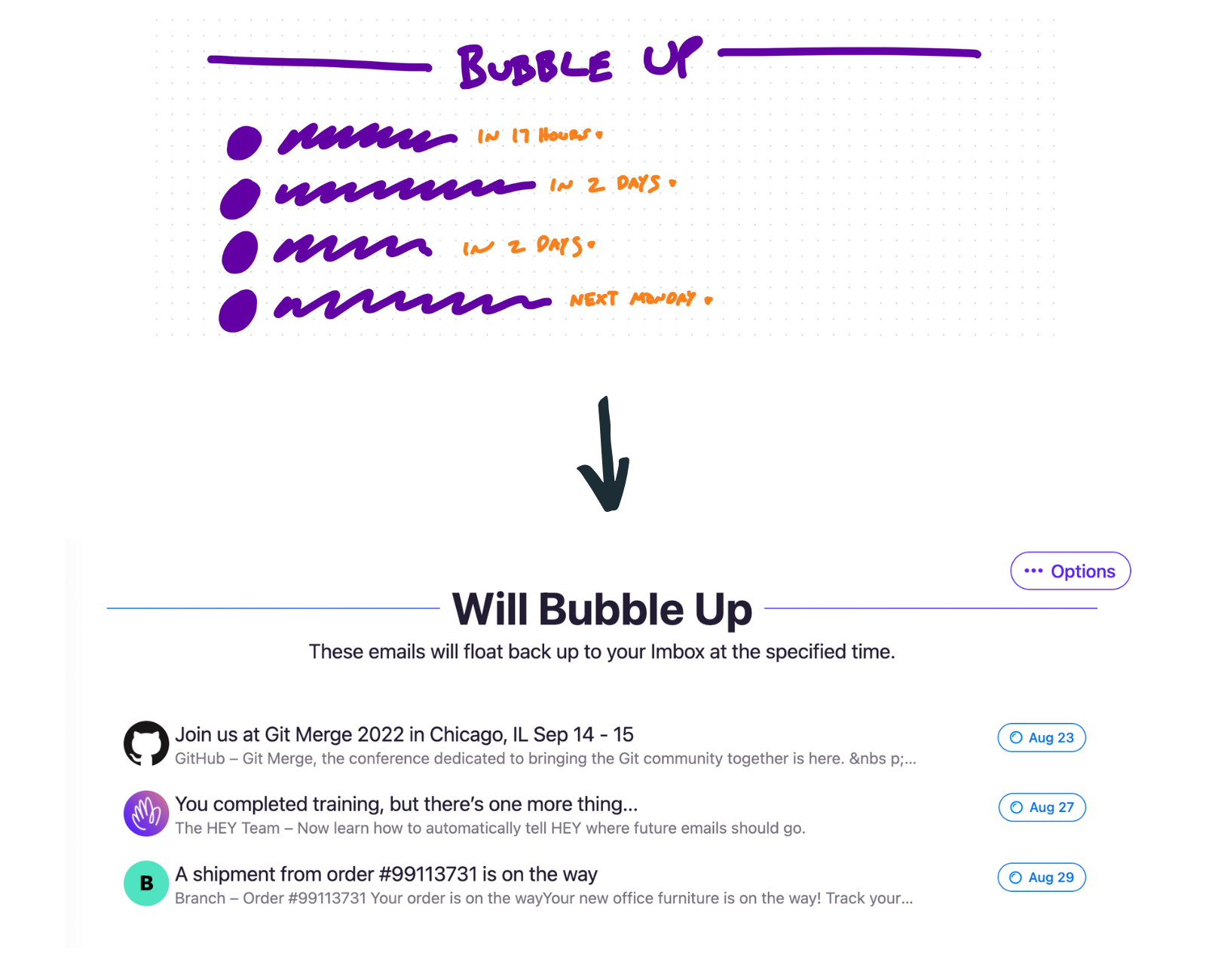
Using our CEO’s fat marker sketches of Bubble Up as a starting point, Michelle began drafting rough outlines of what the tool might look like inside HEY:
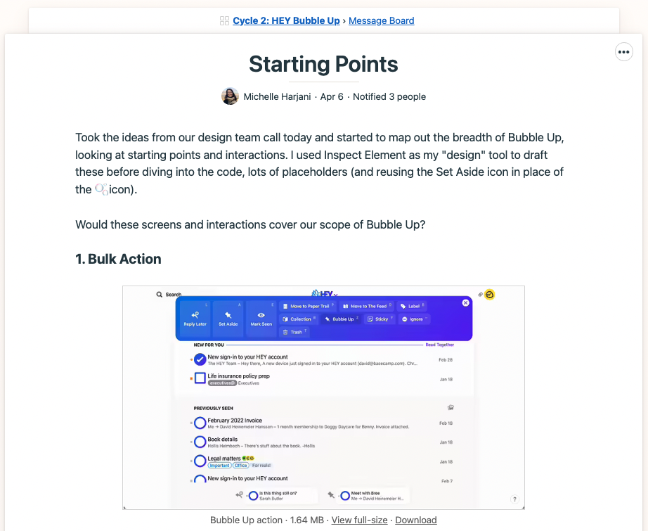
Working through all the various functions and locations where Bubble Up would be accessible (email toolbar, HEY menu, bulk action menu, etc.), Michelle shared her early visions with the rest of the project team inside Basecamp:
After reviewing the initial feedback, she refined her designs and shared a new round of work a week later. Once again, the project team was able to review and leave detailed feedback right inside Basecamp:
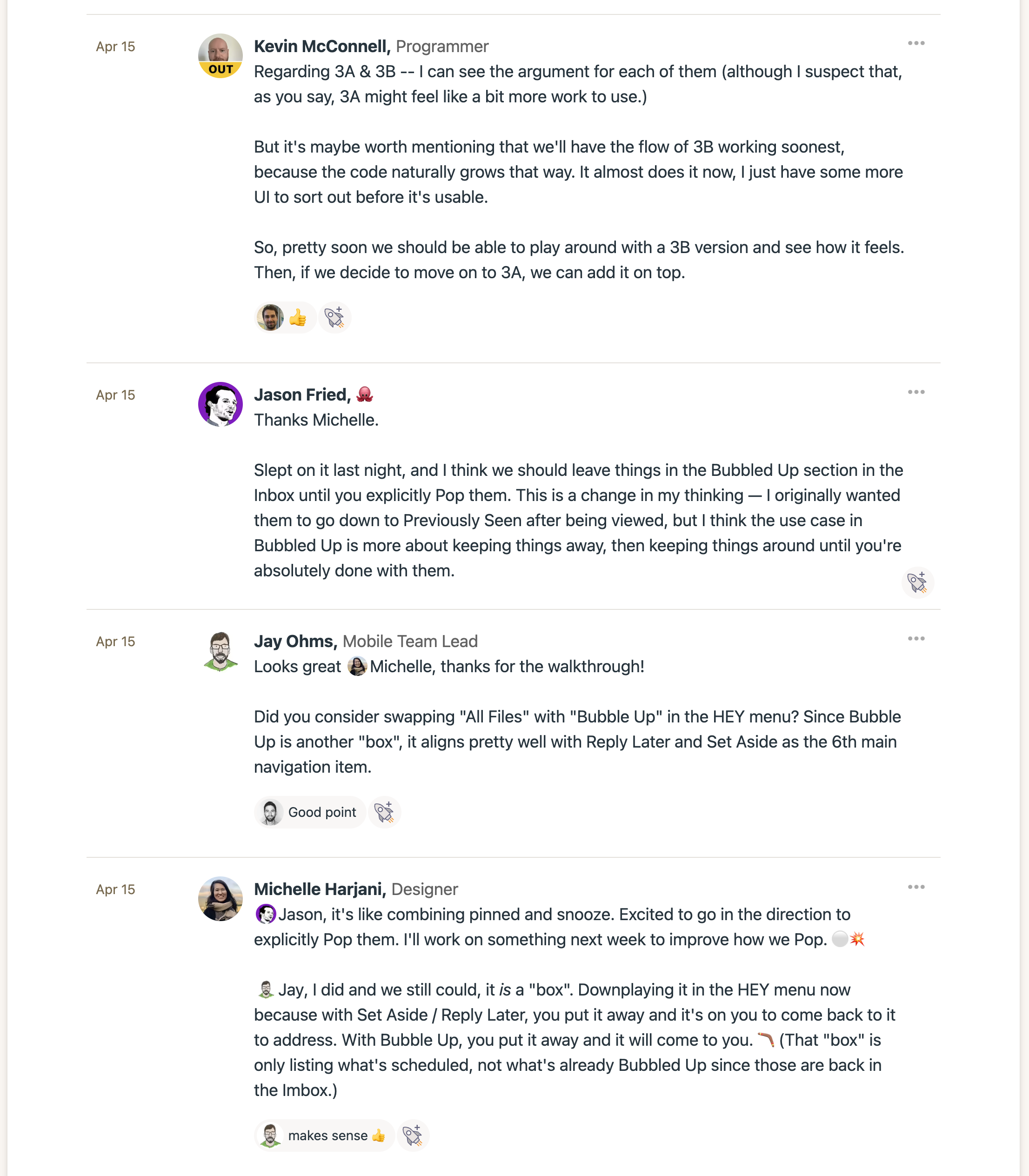
Not only did this asynchronous, written feedback eliminate the need for lengthy (and often unproductive) design review meetings, but it also created a paper trail for Michelle to reference later as she further refined her work.
With everything neatly organized inside Basecamp, it only took Michelle a few weeks to take Bubble Up from paper to pixel.
Bringing Designs to Life with Basecamp
Next week, we’ll show you how Michelle and the rest of the team navigated all the last-minute tweaks, bugs, and other stuff that inevitably creeps up right before launch… without the crazy meetings, endless emails, or pulling all-nighters.
In the meantime, if you’d like to see why designers love to make Basecamp their studio, get started for free today (no credit card, no commitment):
